

Internal feature design - 2022
Feedback messaging tool

My role
Product designer
UX Researcher
Tools
Whimisical - low-fi
Figma - high-fi & prototype
Company
Pack Health, a Quest Diagnostic Company

Overview
Health Advisors play a critical role in Pack Health’s digital coaching programme. They are constantly tailoring each member’s programme to their unique goals and needs. That’s why building rapport is crucial; it fosters trust and enhances member success. One way Health Advisors build rapport is through the feedback they send to members after they submit their weekly health goal. I was tasked to redesign the tool for Health Advisors to send feedback. This redesign reduced the average time to respond to member feedback by 50%.
The current (and lengthy) process
Due to protocol requirements, the feedback messages from our Health Advisors must include the following three components:
1. An affirmation
2. A supporting tip or recommendation
3. A motivational closing statement
While some Health Advisors can write their own messages, most must choose a message from a list of pre-approved messages by the Pharmaceutical Resources Branch (PRB). To do so, they must:
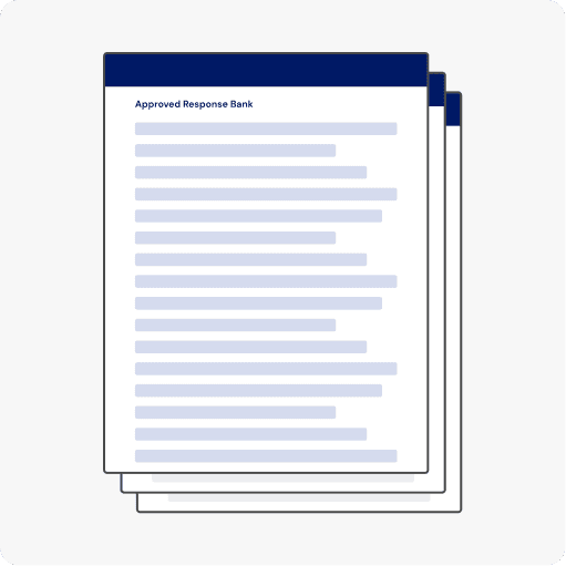
Step 1: pull up the PDF of the pre-approved messages

Step 2: find a relevant message
Step 3: copy and paste the message in the open text field
Repeat these steps 2x to successfully draft a feedback message that follows protocol requirements
The immediate problems
Time-consuming
These simple messages took about 5 minutes to draft. When multiplied by the 10-15 members Health Advisors need to respond to daily, this task can take up to an hour, time that could have been used to support more members.
Relevant messages were buried in long PDFs
The PDFs that stored these messages tend to be 6 to 8 pages, making it hard to find messages relevant to the member. Some Health Advisors worked around this by using command+F to search for specific keywords.
Usability issues with the copy and paste
Copying and pasting from the PDF to the feedback text field loses the formatting of the messages. Health Advisors would have to correct the formatting such as the spacing and spelling.
Annoying to switch between multiple tabs
Health Advisors must have two tabs open to find the message and copy and paste the message from the PDF into the feedback text field.
Other considerations
Our team conducted more user interviews to better understand where sending feedback fits within the end-to-end journey. We uncovered two key insights:
It doesn’t end here...
The workflow does not end after Health Advisors send feedback. Sending feedback is only one step in wrapping up the member engagement flow.
Context is key
Context is critical in drafting relevant feedback. Without context, Health Advisors do not feel confident in what they are drafting.
This led us to think...
How might we help Health Advisors quickly and confidently send feedback messages?
Explorations and user-testing
We brainstormed two areas to place the feedback feature.
A button that opens a new tab solely for composing the feedback message

Combine the feedback feature with the next messaging feature in the end-to-end journey

We entirely got rid of the PDFs and explored several navigation flows to help Health Advisors quickly draft relevant messages following the feedback formula.
Tabs for the different steps of the message formula (affirm, support, close)
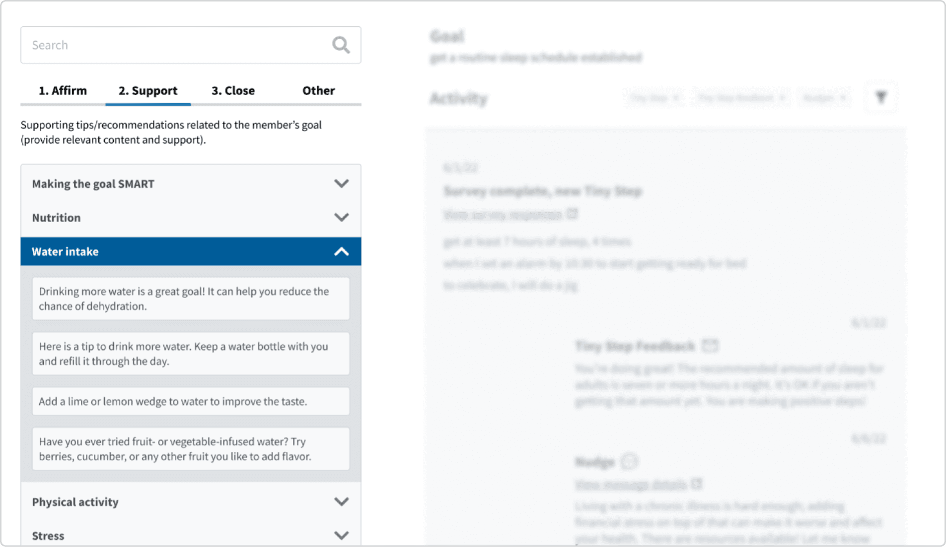
Categories based on health topics

We tested our explorations with 6 Health Advisors and shared them with the leadership team. All of the feedback guided me to the final design.
The solution
Streamlined messages workflow by integrating feedback and messages in one place.
During user interviews, we discovered that Health Advisors were using “nudges”, a separate messages feature, after sending feedback. To simplify and streamline the process, we merged the two functions into one.

Allow Health Advisors to quickly find relevant messages
We eliminated the PDFs and centralised all the messages in one location, eliminating the bottleneck in finding relevant messages.

Quickly select relevant messages
Health Advisors can quickly select messages with a single click, which automatically populates in the feedback form field, eliminating the need for copy and paste. This also spares our Health Advisors from manually adjusting the format in the form field.

Increased confidence in crafting messages by providing context
Added a “last used date” on the feedback messages, helping Health Advisors avoid repetitive messages.

Provided contextual information like the member’s goals and weekly goals so the Health Advisor can see how their feedback is relevant to the member.

Impact
This redesign reduced the average time to respond to member feedback by 50%. See what our Health Advisors have to say:
The UX update is so nice!! I'm seeing it for the first time with one of my members that needs feedback and nudges to be scheduled! Thanks for your work on this!
Not sure if y'all have tried the new process for scheduling feedback and sending nudges on survey, but it's great! Definitely less trouble since you can hide messages sent in the last 14, 30, 90 days, or all time, and just select and choose.
Reflection
Limitations on personalisation
While we've made some improvements to streamline the process, there is still additional work needed to enhance the content of the feedback messages. The use of a pre-approved message bank can be restrictive for Health Advisors who want to craft personalised and unique messages.
More research never hurts
My product manager requested low-fidelity designs to start with, but I hesitated because I didn't fully understand the end-to-end journey. I asked more questions, which uncovered knowledge gaps in the flow. This approach allowed me to do additional user research. I’m glad I trusted my instincts to seek clarification which led to more research.