

Responsive design - 2025

My role
Lead product designer
UX Researcher
Team
Engineers, content team, product managers, health coaches
Company
Pack Health, a Quest Diagnostics Company

Context
In all Pack Health coaching programmes, members receive weekly lessons that contain learning materials and a health questionnaire. The purpose of these lessons is to teach members strategies on how to reach their health goal and to assess the member’s health and wellness so their health coach can personalise the program to the member. The lessons are a core part of our member’s experience, but it hadn’t been meaningfully revisited since it was built. Aside from minor bug fixes, there had been no effort to evaluate or improve it.
Opportunity
The first lesson completion is a leading indicator of long-term programme retention, yet the lesson experience hadn't been revisited in a while. This created an opportunity to increase retention and to properly assess the experience with users all while updating it to match design principles, accessibility standards and our brand.
Current lesson experience
The lessons are divided into three sections: content, health questionnaire, and confirmation.
Content
Upon landing on the page, users will see a piece of content that can come in the form of a video or a blog.

Health questionnaire
Under the content is a set of health questions for the user to answer so their health coach can personalise the programme.

Confirmation
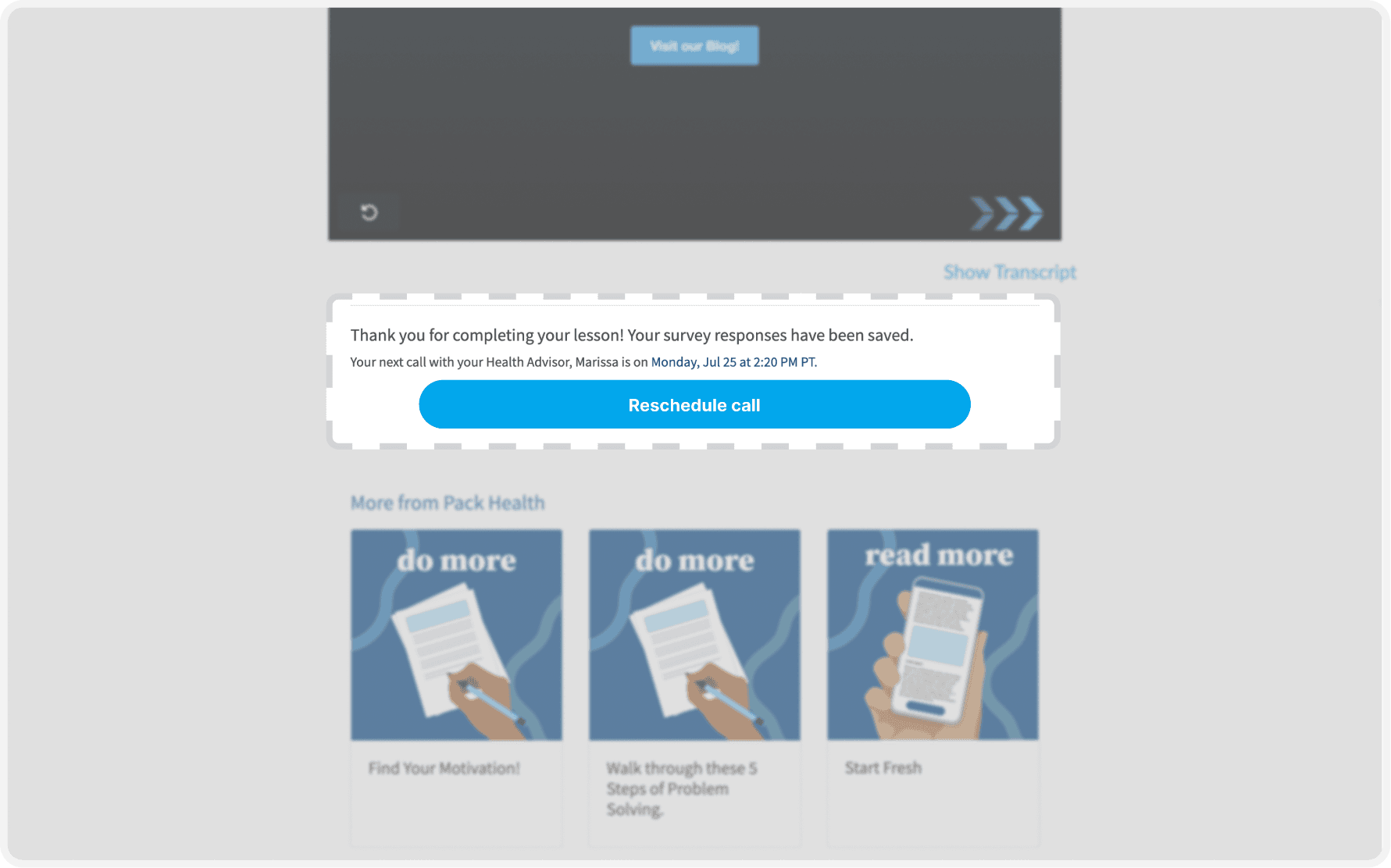
Once the user finishes the health questionnaire, they will see a confirmation along with the details of the next meeting with their health coach.
The problem space
After conducting user interviews with health coaches and members, we uncovered 2 key issues with our lessons.
Members wouldn’t finish the lesson because they didn’t know the value it would bring to their coaching experience. They didn’t know why they should answer the health questionnaires. They didn't realise their health coach used their responses to further personalise the programme to the member. This issue is heightened with lessons with several pages of health questions.
Some members didn’t know when the lesson ended. There was a lack of affordances and feedback on how users should continue with the lesson experience after landing on the page. Some members engaged with the lesson material without knowing there was more to the lesson.
Stakeholders
Besides our members, a few cross-functional teams were invested in the lesson experience. This shaped the priorities and constraints for the project.
Content team
The content team managed the lesson materials through an external platform. Updates to the lesson experience should ensure that the content team can efficiently manage the hundreds of materials they have.
Health coaches
Our health coaches discuss the lessons with our members, so naturally our coaches had a lot of feedback about the lessons.
Engineers
The lesson code was very old, which introduced technical constraints on what we could do.
Final redesign
I redesigned the experience to better align with our brand and usability principles. I also introduced a more guided, intentional flow by setting clear expectations, incorporating moments of purpose, and reducing cognitive load.
To set clear expectations, I added a stepper that outlines the lesson. I also broke the core lesson sections into separate pages, giving each page a defined purpose.

Before the health questionnaires, I introduced a "check in" to give context as to why we ask the following health questions and how their responses inform their experience.

For the questionnaires, I improved usability by narrowing the question width to enhance readability and reduce eye strain. I also increased the target size of the responses to make selection easier.

Once the user reached the end of the lesson, we provided clear feedback that ties the lesson back to the coaching experience, reinforcing continuity in the programme.

Reflection
Although the redesign initially seemed straightforward, this was a huge undertaking because multiple teams had competing priorities in this redesign. Our content team built all the lesson materials in an external platform, our health coaches had many requests because they hear about the experience from their members, and our engineers were working with legacy code that hadn’t been touched in years.
As the lead product designer, the challenge wasn’t just improving the experience, it was learning how to balance these needs to build a meaningful and scalable solution. I held several meetings with the cross-functional teams and even hosted workshops to guide us towards a shared priority list, all while working closely with our engineer team to design within technical constraints.