

Responsive web app - 2022
Pack Health Member Portal

Time
8 months
My role
Product designer
UX Researcher
Team
Engineers, content team, product managers, health coaches
Company
Pack Health, a Quest Diagnostics Company

The current landscape
Lifestyle changes are hard to make. Especially for those who have established a routine with their work, kids, and other responsibilities. It can be difficult to squeeze in the time and effort to work on health goals set earlier in the year. That’s where Pack Health’s health coaches come in. Over the course of 12 weeks, health coaches work with members to develop strategies to build and maintain sustainable healthy habits. This can be as simple as parking further at work to walk an extra 5 minutes. The coaching is done through emails with lesson materials, text messages, and weekly phone calls. After the 12 weeks, members can only communicate with their health coach through text.
Take a look into what a week can look like…

Member receives a reminder to complete their lesson
"Oh snap! I need to finish this before my call with my health coach this afternoon”

Member fills out their lesson
“Hm...what should my health goal be this week? I guess I’ll just put what I put last week...”

Phone call between member and their health coach
They talk about the member’s week, barriers, and strategies for the upcoming week.

Member continues on with their week with their health goal
They may receive reminders to work on their health goal throughout the week.

Member may try to fit in their health goal throughout the week
Member have to remember to fit in their health goal in between all of their other responsibilities.
Illustrations by Lucian Popovici
Initial research
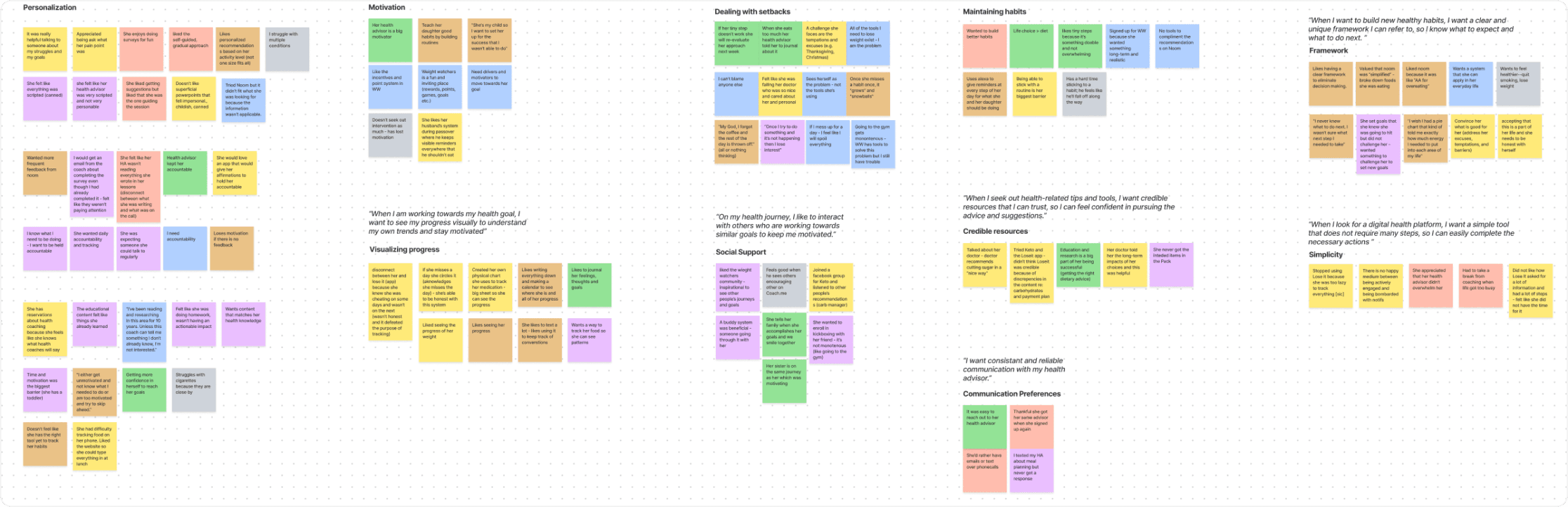
At the time, Pack Health lacked digital tools for our members, but we recognized the growing expectation for one. Especially in the space we’re in, we needed innovation to keep up with market demands and our competitors. To kickstart this process, we conducted user interviews with active members, former members, and individuals living with chronic conditions. We also conducted user interviews with our health coaches because they know our members the best. They talk to our members every day; they build rapport with our members, so it was important for us to involve our health coaches. Through an affinity mapping workshop, we identified recurring themes.
User stories
I synthesised the themes from our affinity maps into user stories.
“When I give health-related information, I want personalised and frequent feedback, so I know if I’m heading in the right direction or not”
“When I am committing to a digital health platform, I want to identify my barriers and learn about new approaches, so I do not go back to old approaches and repeat the same mistakes I’ve done in the past”
“When I am working towards my health goal, I want to see my progress visually to understand my own trends and stay motivated”
“On my health journey, I like to interact with others who are working towards similar goals to keep me motivated”
Common pain points
Although our health coaches provide support and accountability for our members, the formatting of our programmes posed certain challenges for our members.
Members had little insight on their progress towards their health goal
Each week, members are prompted to assess if they achieved their goal. Often, members must rely on their memory to recall their activities. This made members more reliant on their health coach to talk about their behaviour patterns and the progress they made. For our members, visualising their progress is crucial. It directly impacts their motivation, health self-efficacy, and willingness to continue working on the strategies they developed in the programme.
Hard to keep track of the activity they’re supposed to do before a call
Activities and resources were distributed through email and text messages, while phone calls were reserved for members to discuss any topic they wished. Although these channels of communication served distinct purposes, there was no centralised point for members to refer to regarding their programme. Additionally, members were likely to forget their tasks, and if they wanted to review past activities, they had to sift through lengthy text messages.
Members could not see their previous habits and whether they achieved their goals or not. Each week, members blindly set a new goal. We heard from members that they wish someone could tell them what goal to set or get more guidance on what they should be working on.
UX Strategy
Together with my design lead, we created low-fidelity wireframes and a site-map to share our vision of the MVP with our product team, engineers, and other departments. This created a visual baseline for all of our discussions moving forward.
Based on our findings, we prioritised:
providing visibility to their programme journey and history.
tracking ability for their weekly habit.


Selected low-fidelity designs on the home page
Considerations
Easy to understand
Members of various ages participate in our programmes. Our designs should be simple enough that a 24-year-old and a 64-year-old could understand.
Health journeys are not linear
We want our designs to motivate members towards a healthier lifestyle. However, we do not want our designs to deceive or shame members if their health journey is not going according to plan. Everyone experiences bumps in the road and they should never feel bad for it.
Iterations
All of the designs went through several rounds of iterations based on user and stakeholder feedback. Here are just a few iterations of the progress page and the home page.


Explorations of the progress page


Explorations of the home page
Selected final solutions
A central hub to streamlined communications and program activity
Upon opening the web app, members immediately know where they are in their programme and what they need to do. This consolidates the information so they can focus on their progress towards their health goal and their activity before their next call.

Provide insight into past health behaviours
From our user interviews, we learned that members were writing down habits to track them. Presenting a history of their habits provided more value to our members. Members can now see what they’ve previously worked on so they can identify how they should move forward in their programme.

Weekly tracker
The current experience did not allow members to reflect on their activity. We wanted to give members the tool to accurately track the goals they’re working on. This allows two things:
Health Coaches get a better insight into their members’ goals. This helps them tailor the programme more to their members’ needs.
Members can now see what they’ve completed and what they still have to do.

Impact
After launching the member portal, we saw a 3% reduction in member cancellations. We also saw a 15% increase in program engagement.
“The health portal is a good way for me to to check stuff and log my goals - it’s a good move!”
- Member
Reflection
Gathering stakeholder feedback earlier and often
At the beginning of the project, I only showcased my designs to the entire engineering team when a low-fidelity concept was fully fleshed out. After the engineers shared their feedback, I found myself having to change a lot of the design. Once I realised that this was an inefficient way to design, I worked with my product manager to combat this challenge. With every design, we gathered a product manager, a product designer, and an engineer, to regularly connect on the design. From its early ideation to high-fidelity designs, I shared all the designs with my engineers to scope the feasibility of the design. This also made our engineers feel more included in the solution; it was a system that worked for our team. Once we get to a good place with the design, I shared it with all the engineers. By forming this trio, I got feedback earlier and eliminated all of the back trackings I used to do.
Embedded a regular user feedback cadence into each sprint
I embedded research into our sprints instead of focusing on project based discovery. This was inspired by Teresa Torres’ Continuous Discovery Habits. No matter where we were at with the designs, we regularly connected with 4-6 members every sprint to get feedback on the design we were working on.